我们在用 uni-app 开发前端页面时,往往需要修改一些组件的默认样式,特别是颜色。那么如何修改 radio/checkbox/switch(单选框/复选框/开关)的样式呢?可以通过覆盖样式的方式实现。
下面以单选框 radio 为例(基于 colorui)说明。
在 App.vue 文件的 style 中增加以下样式覆盖 colorui 的样式:
/* 重设 radio、checkbox 大小和位置,否则在不同分辨率小会变形 */
/* #ifndef MP-ALIPAY */
radio::before,
checkbox::before {
    margin-top: -8rpx;
    right: 8rpx;
    font-size: 36rpx;
    line-height: 16rpx;
}

radio .wx-radio-input,
checkbox .wx-checkbox-input,
radio .uni-radio-input,
checkbox .uni-checkbox-input {
    margin: 0;
    width: 48rpx;
    height: 48rpx;
}
/* #endif */

/* 覆盖样式修改颜色 */
switch.theme[checked] .wx-switch-input.wx-switch-input-checked,
checkbox.theme[checked] .wx-checkbox-input,
radio.theme[checked] .wx-radio-input,
switch.theme.checked .uni-switch-input.uni-switch-input-checked,
checkbox.theme.checked .uni-checkbox-input,
radio.theme.checked .uni-radio-input {
    background-color: #FB5F43 !important;
    border-color: #FB5F43 !important;
    color: #ffffff !important;
}

/* 鼠标移到上面的边框颜色 */
uni-radio:not([disabled]) .uni-radio-input:hover, uni-checkbox:not([disabled]) .uni-checkbox-input:hover {
  border-color: #d1d1d1!important;
}
在对应组件中加上 class="theme",如下:
<radio-group @change="changePayType">
    <radio class="theme" :class="payType === '1' ? 'checked' : ''" :checked="payType === '1'" value="1"/>
    <radio class="theme" :class="payType === '2' ? 'checked' : ''" :checked="payType === '2'" value="2"/>
</radio-group>
单项选择器的切换事件 change 如下:
export default {
data() {
return {
payType: '1'
}
},
methods: {
changePayType (e) {
this.payType = e.detail.value
}
}
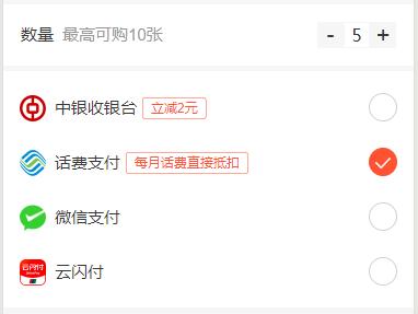
}最终的运行效果图如下:
注意事项:
- 仅测试 搜狗、Chrome、Edge 浏览器,以及微信小程序、安卓APP。
- APP 在切换 radio 时,会有蓝色闪现,时间很快。
APP 兼容性问题欢迎指正,或者有其它的实现方式,希望大佬们不吝赐教。
版权属于:瞭月
本文链接:https://www.lervor.com/archives/74/
版权声明:本文为瞭月原创文章,转载请附上原文出处链接和本声明。